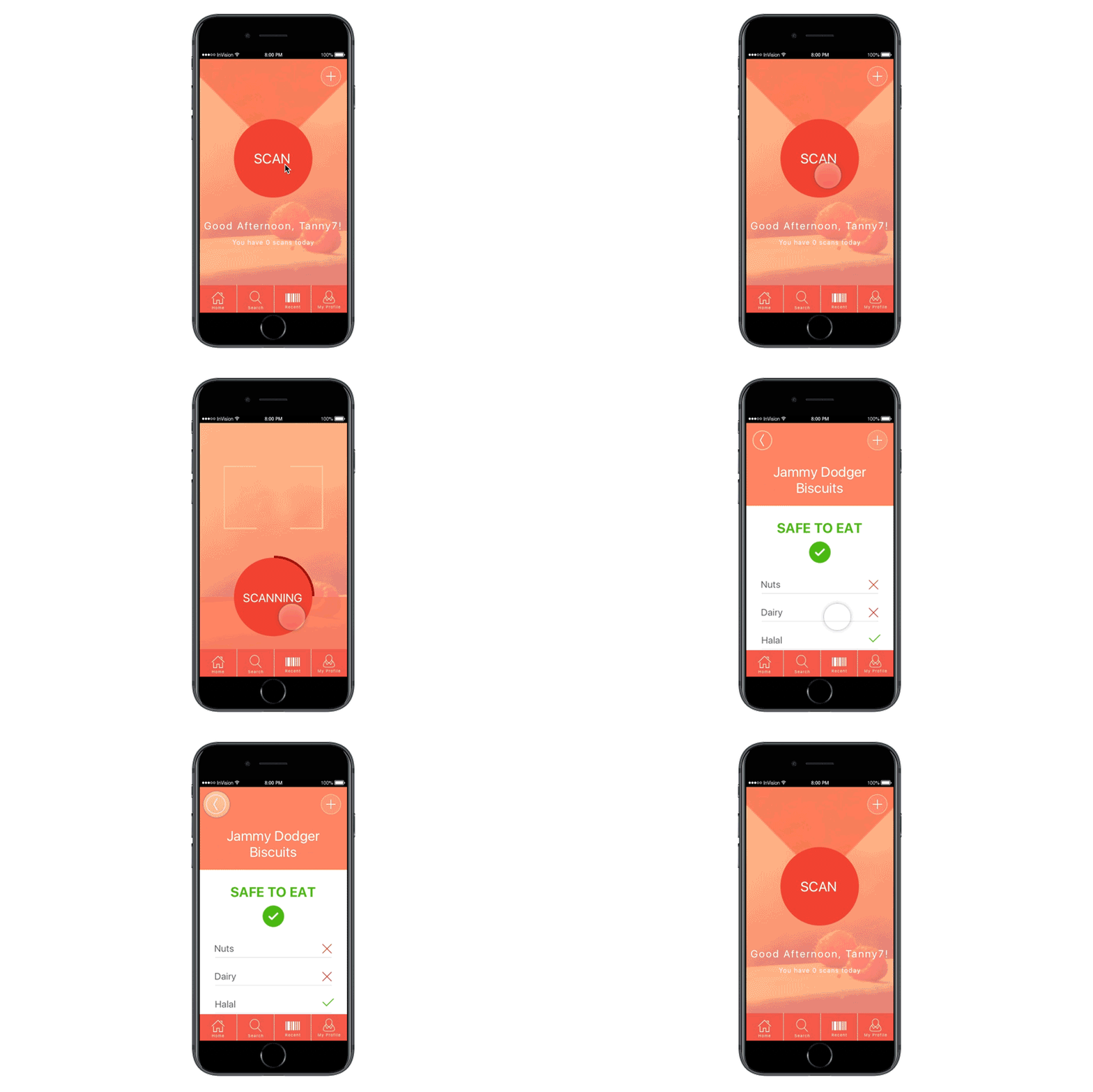
The What’s it in App was created part of my User experience and design class in my second year. The task was to work in groups to research, design, prototype and test a digital product, and review and evaluate findings of the process.
The concept was to create a QR code/food scanner app that is used to identify potential food allergies of users and help access if food is safe and edible.
We chose to create an original idea because after compiling and accessing our research which included user competitor analysis, user personas and user journeys which all showed that food allergies were on the rise and there was niche in the
UK market for a food allergy app. The full evaluation report can be found here
Design was an important aspect of this project, both the UX and UI where discussed in great detail between the team before the final product was created individually. Using the agile methodology, design iterations were produced throughout
the process, starting with hand drawn design, Axure wireframes, Sketch design and Invision prototypes.
Link to Axure Wireframes
Link to Invision Prototyping


The app was designed to be user friendly and informative with a simple and clear layout. The homepage shows the username of the desired user, and a simple tap mechanism to to click to scan.
The other tabs in the app included a recent searches and my profile section where shows further details of the user.
This was my first time using the Invision prototyping app and it was excellent in creating the little animation effects to increase the UI of the app. In the future I will incorporate Invision prototyping in more of my app products to show both design flair and interactivity.

